giffgaff
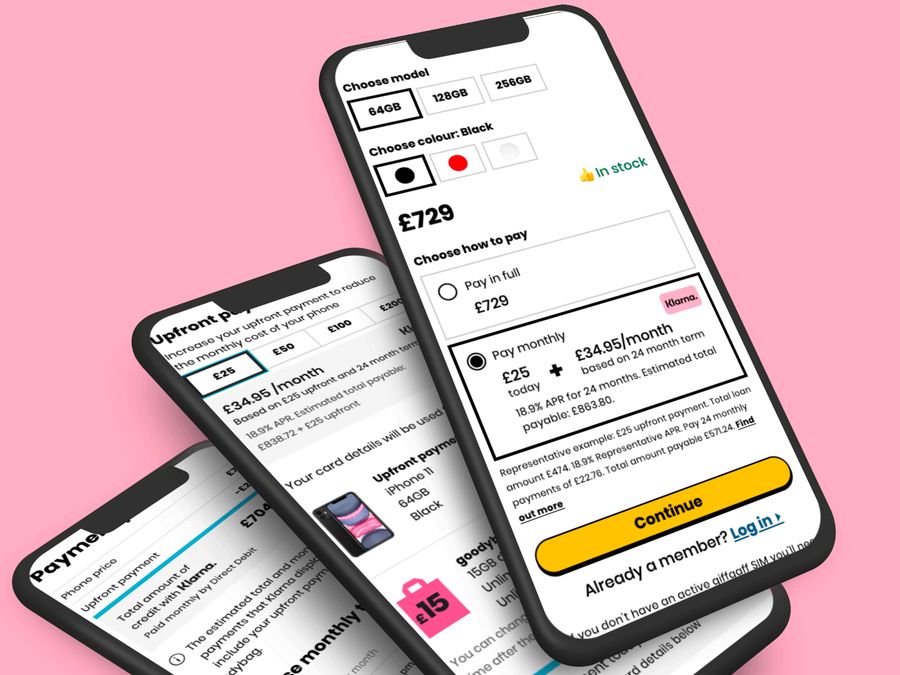
Introducing Klarna as a payment option when buying a phone
The challenge
Create a seamless experience that gives users the ability to choose from flexible payment options to suit their needs and budget.
Key objectives
- Improve the experience when buying a phone with a loan
- Remove design and tech debt to create better tech foundations
The process
Research
I led the research of the project, which involved:
- Journey mapping
- Usability testing
- Market research (SEO / terminology etc)
- Focus groups with Pioneers
- giffgaff Community
- Help agents
- Data / BI / finance
- Competitor analysis
- Klarna (website and development documents)
- We bought a TV using Klarna
Existing experience
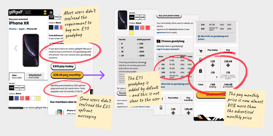
I started by mapping out the existing user journey and conducted a round of usability testing on the current experience to find key pain points for users.
Pain points
- Price shock
- "It's added a £15 goodybag to the price"
- "I wasn't expecting to have to pay £25 upfront"
- "Previous step said £29.49 a month now it's £40 today then + £44.49 a month"
- Confusing proposition
- "What is a goodybag?"
- "Says 'no contracts' but it's forcing me to buy a goodybag"
- "It says minimum £10 but it's added a £15 goodybag"
- Confusing copy and design
- "It says 'Choose how to pay for your phone', I thought I just did that?"
- "I don't understand what the £15 is for, is it delivery?"
- "There's too much going on, not really sure what to look at"
- 'Loan referred' journey
- "It says referred, what happens now?"
- "When I clicked the link in the email, I had to start the whole process again"
- "My loan got approved [24 hours later] but the phone was then out of stock"
In addition to these we knew the general layout was not mobile-friendly, had various bugs and there were inconsistent experience across new and refurbished phones.
'Loan Referred' meant additional checks had to be made before the loan was approved, but it was unclear for users what happened next. If the loan was eventually approved, they would have to start the process again and often the phone would be out of stock. Moving to Klarna would remove this problem, as they make a 'yes' or 'no' decision immediately.
Data led
- Despite defaulting to £15, most users choose £10 goodybag (cheapest)
- Majority of users paid £25 upfront (cheapest)
- Almost 15% of users are 'referred', of which less than 50% complete purchase
- Drop off rate between the plans page and checkout was high
* Due to commercial sensitivity I have changed and/or left out some data
Considerations
We had several meetings with Klarna to understand both the limitations and the opportunities. We soon established some challenges...
- Member pays for loan via Klarna's hosted widget
- Klarna's solution takes upfront payment with a payment card and monthly payments via Direct Debit (2 different sets of details) - currently, giffgaff takes upfront payment and goodybag payment with card
- Card details can not be passed between giffgaff and Klarna
- Loan payment options made can not be passed from giffgaff to Klarna
A/B test
We knew that the 'loan calculator' in our existing journey would be additional effort and that we couldn't achieve parity using Klarna, as we couldn't pass the user's selection to them. For example, if a user selected to pay over 36 months on our site, Klarna would default to whatever we had set it as, which was 24 months.
With that in mind, I proposed we tested moving the loan calculator to a later step. This would mimic what we knew we could achieve with Klarna and also meant the 'Plans' page was only about choosing a plan, reducing cognitive load for the user.
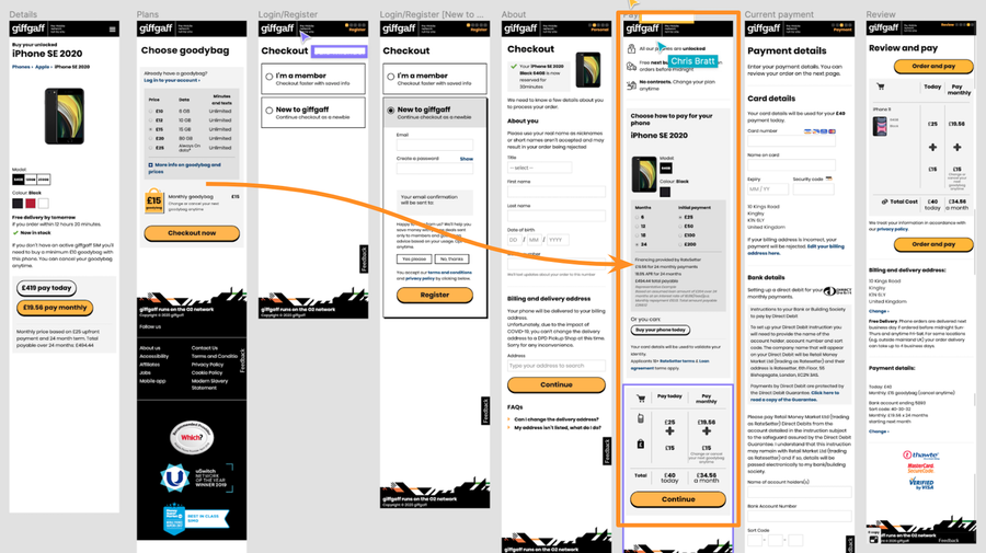
The results of the test showed no significant change to conversion rates, meaning we had confidence that we could launch without having to build the calculator feature.
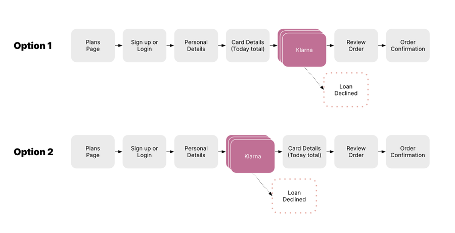
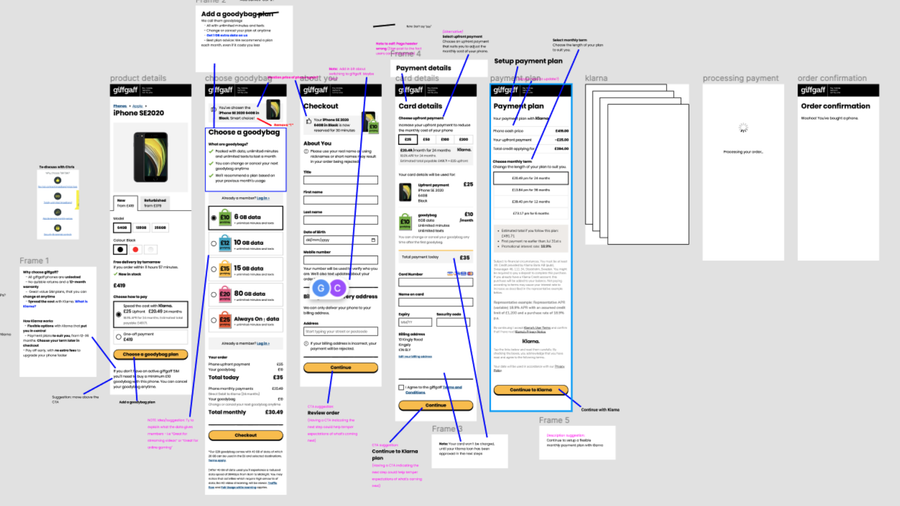
Based on learnings from discussions with our engineers and Klarna's team, there were 2 viable user journeys that we would take forward to usability testing.
Design
Collaborating closely with a UX Content Writer, legal, and marketing, we refined the existing content. Our approach involved starting from existing material, with a focus on streamlining the message and enhancing its clarity.
Feedback and learnings
Throughout the project we had several methods of receiving critique/feedback and continuously learning:
- Usability testing
- Weekly Work in Progress meetings
- Critique sessions
- Regular design reviews with key stakeholders
- Weekly reviews with Klarna and working group
- A/B testing
Prototype
We'd been usability testing using a Sketch prototype, which meant various limitations on what we could test. Due to the constraints preventing us from passing data to Klarna from our side, it was vital we had confidence that users understood:
- What they were buying
- How much they were paying
- Who they were paying
- When they were paying
I decided to create a coded prototype and use localStorage to capture selections. This meant users could choose different options throughout the flow and gave a much more realistic experience then flat screens.
Outcomes
- Launched on time
- Conversion and attachment rates increased
- Removed the 'referred loan' experience
- Significant reduction in loan-related customer service queries
- Removed tech debt
- Page performance and accessibility improvements
