Graze.com
Pistachio: A front end framework and design system for graze.com
The challenge
In 2013 graze.com launched a new responsive website that used Bootstrap with custom overrides. Since then additional styles had been regularly added without any formal process, sometimes for individual use.
Within two years the framework had become bloated. Developers were searching the codebase for similar elements, such as buttons, or rebuilding them with subtle differences. Style patterns across the website were inconsistent and leading to a poor user experience.
The goal
Create a style guide to establish a common language, enforce a more sequential workflow from design through to development and create a more consistent experience for the user.
The process
Research
I performed some research to find leading examples of style guides, which I presented to the team. The three that we were most inspired by were Lonely Planet, MailChimp and Gov UK. We also read a lot about Brad Frost's Atomic Design methodology, which heavily influenced our approach.
Site audit
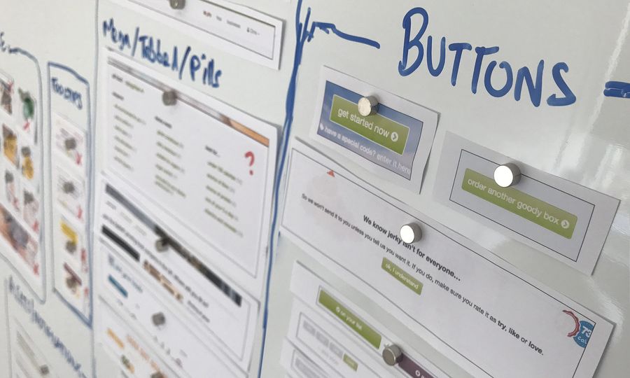
I performed an audit of the website, which included taking screenshots of each page and specific elements, printing them out and putting them up for the front end team to look at. We also performed some online tests which included a colour palette test.
What we discovered...
- The site had inconsistencies, even on individual pages
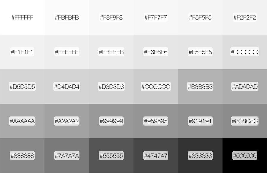
- We had over 200 colours including 30 monotone colours alone (many of which were imperceptible)
- We were using seven different button styles
- As many as 10 different fonts styles on a single page
Together with the front end developers we went through the various screenshots voting whether to keep, drop or redesign. We put together a list of simple items that we knew we needed which included alerts, buttons, form elements, typography and colour palette.
Although brand colours themselves were created by the creative team, it was our responsibility to ensure that they were used in the correct way for usability purposes on the website. For example, the old framework had many shades of grey that wouldn't be seen by many users, either because of visual impairment or because of the monitor they're using.
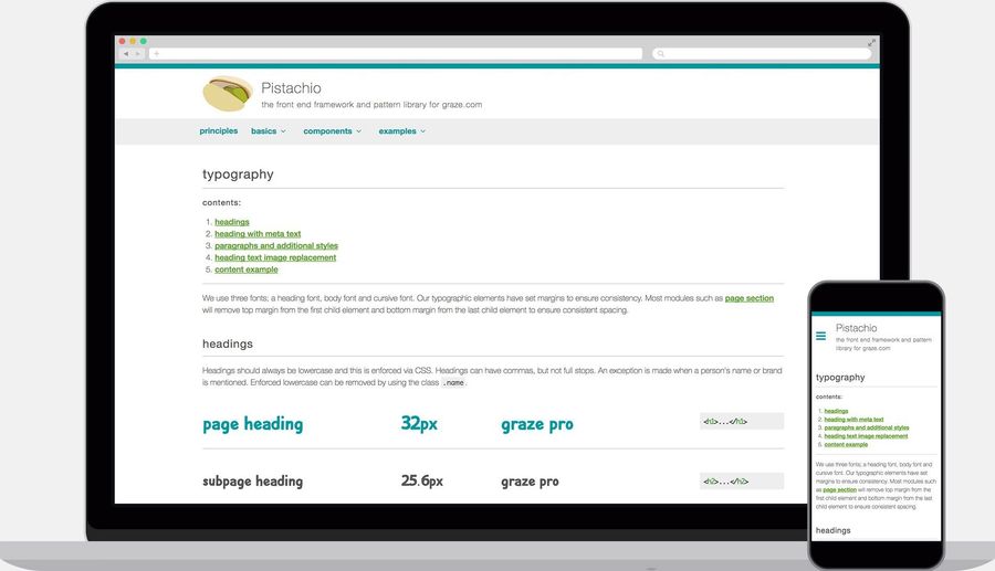
We were supporting 6 different fonts (4 custom fonts) and various different styles assigned to classes. Because of how we had arranged styles and class names, it meant that dozens of combinations could be created. For example, <p class="lead h3"> was being used. The 'lead' class to make the font size larger and weight lighter and the 'h3' class to add a margin. This was something we needed to avoid in future.
Over the course of four months more items were added, as long as the team believed they belonged within the framework. If it was an item that was going to be used in more than one place it was added as long as there wasn't something that already existed that could be used instead.
Our structure
Basics
- Buttons
- Colour palette
- Forms
- Images
- Lists
- Tables
- Typography
Components
- Accordion
- Alerts
- Breadcrumbs
- Health badges
- Icons
- Navigation
- Page sections
- Pagination
- Panels
- Progress
- Ribbons
- Sashes
- Stickers
- Tooltips
Templates
- Article page
- Drop down menu
- Feature page
- Off screen menu
- Product tiles full width
- Product tiles with nav
The outcome
The end product was Pistachio - a design system that enabled designer to rapidly prototype, improved design consistency and enabled engineers to develop faster.
Update: Pistachio is no longer publicy available to view but graze.com continues to use the design system.