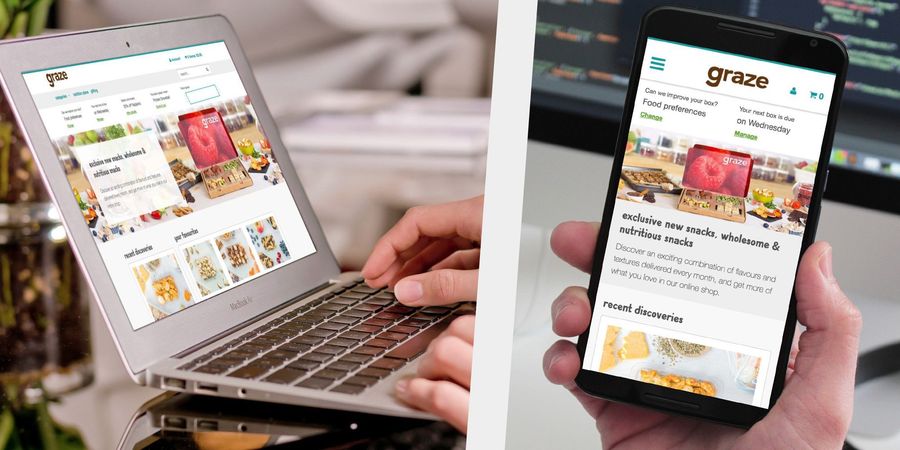
Graze.com
Reimagining the member experience of graze.com
The challenge
Since launching in 2008 graze.com had solely been a subscription service delivering a box of 4 snacks to it's customers. In 2015 they launched an online shop that allowed customers to buy snacks without the need for a subscription. The customer experience, however, was disjointed and causing confusion.
The goal
Bring the shop and subscription service together into one customer experience supported by a single platform. Help customers discover exciting new ways to snack healthily that fit their lifestyle.
The process
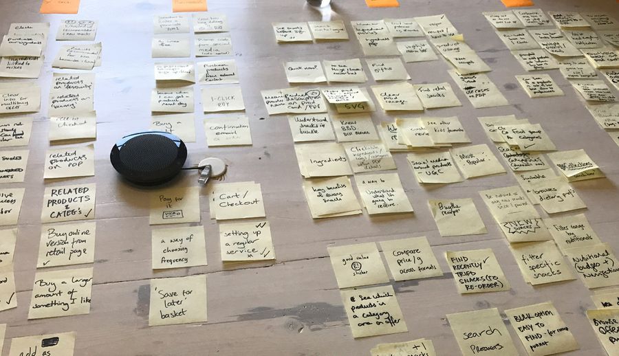
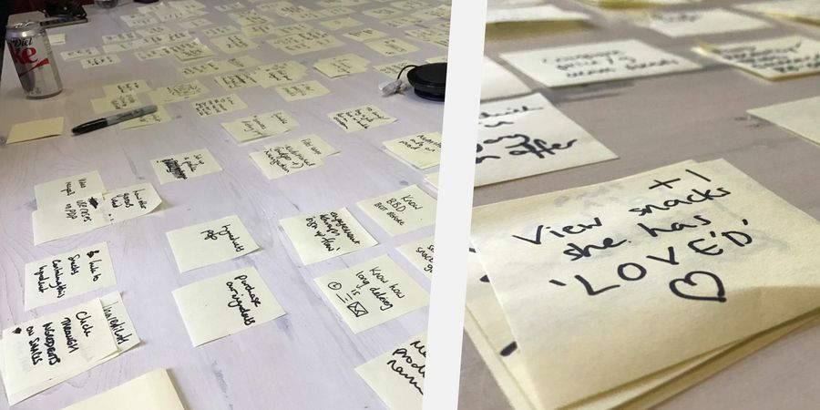
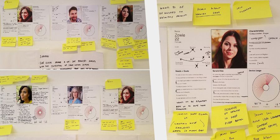
We kicked off the project with three days of discovery workshops. During this time we looked at key data points, created proto-personas, spoke to the customer service team and customers about their needs and wants and held a brainstorm session to outline key areas to focus on.
The proto-personas were refined in a review session which included key stakeholders and members from the brand insight team.
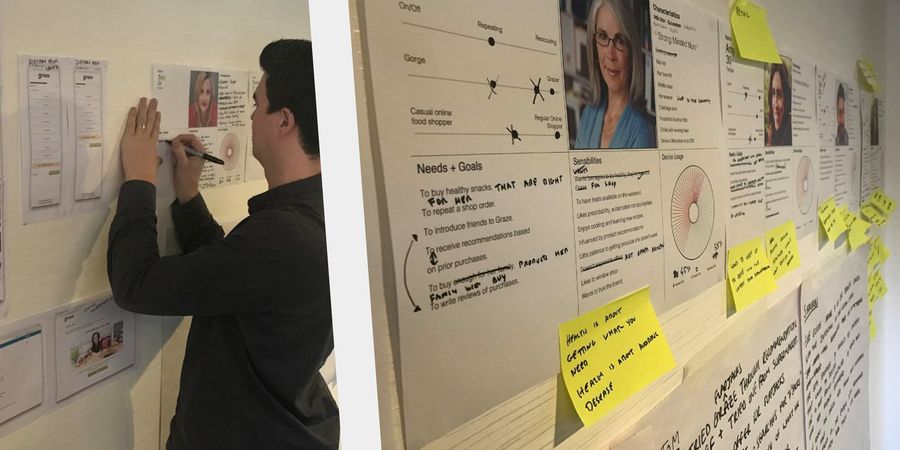
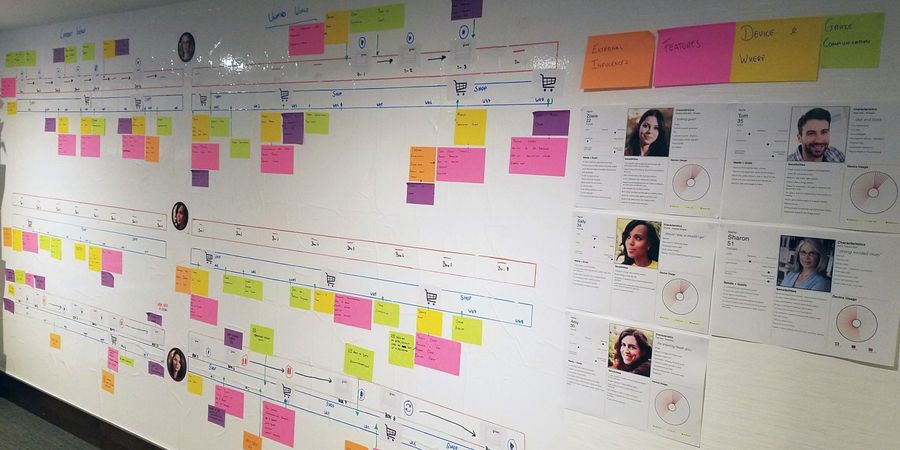
Using these personas we mapped out each users' touch-points with graze in the current world to highlight any confusing areas and stress points. These touch-points weren't restricted to just the website, but included social media and offline events, such as purchasing a graze snack in a high street store.
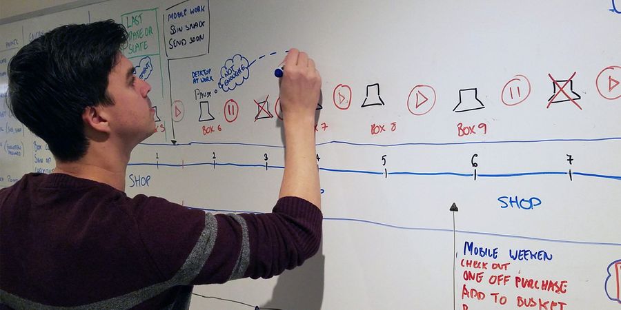
Once we had completed this we began mapping out a hypothetical future world to demonstrate the potential in certain areas.
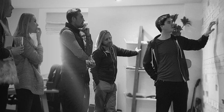
Design reviews were an opportunity for key stakeholders to have full visibility of the work we were doing and to discuss our assumptions and share ideas.
During the project much of the business strategy was still yet to be decided so it was important to communicate as often as possible to ensure everyone was aligned. I designed several multivariate tests which helped to guide us and make data-driven decisions.
We established five areas of focus:
- Product browsing
- Box curation (subscription)
- Purchase
- Subscription sign up
- Account management
The prototype
I started creating a low fidelity prototype using Sketch and Invision - mobile first. This was used to communicate the team's current thinking and direction we were going in. It was not the solution, but a foundation and discussion point to build from.
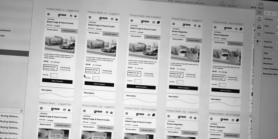
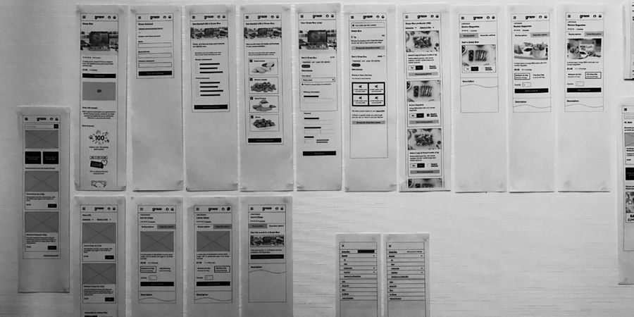
The team found it was an incredibly useful tool for us to have early on as it meant we could visualise the overall experience. However, it soon became apparent that this type of prototype was not agile enough.
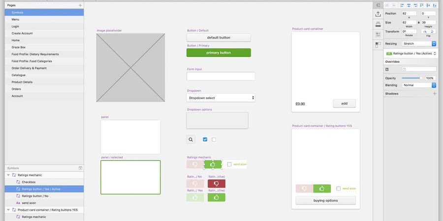
I was having to make iterations to the prototype on a daily basis and although I was using symbols, it meant a lot of repetition across many screens. We were also finding that in user testing we were having to force people down linear paths, which isn't natural behaviour.
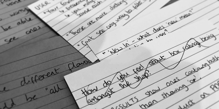
I made the suggestion that we build a fully working HTML/CSS prototype. Initially this was going to be with basic PHP includes, but after a discussion with the developers we decided to use Ruby and Middleman.

This approach meant we could start building page templates, such as a product details page template. We downloaded the product database from Magento which we then used in the prototype so we had a working product catalogue. Using cookies we were able to create user-state specific content. One of our front-end developers even coded a functional basket, meaning users in testing could really feel like they were using a working website. Another feature we added was the ability to set whether the prototype was in 'grayscale' or 'colour' mode.
The outcome
Our user testing very much guided what made it into our backlog. We quickly found features that users loved and some that they didn't like at all. Features such as trending snacks and a quick links account bar both tested very well, so both of these were pushed into production very early on. The other major piece of work to go live was a unified logged in homepage that put personalisation at the forefront.
